

The internet loves to sell UGC style ads as the easy button. Find a creator, ask for “something authentic,” launch it on Meta and TikTok, then sit back while your CAC magically behaves. Cute story. Also how a lot of brands light money on fire.
UGC style ads do work. They work absurdly well when the strategy is tight, the testing velocity is high, and the creative fits the platform it's running on. But the part nobody likes to say out loud is that UGC is not easier than polished creative. It's just a different kind of hard. Less studio budget. More operational discipline.
If you want the unvarnished version, here it is. The ugly part is fatigue, creative churn, creator management, rights, hook testing, and the fact that one “winner” means nothing if you can't replace it next week. Toot, toot. We've all learned that one the expensive way.
Here's the part the UGC crowd keeps dodging. The ad does not win because it looks casual. It wins because the casual look hides a disciplined creative system.
Brands that scale this format are not tossing an iPhone to a creator and hoping for magic. They script hooks with room for natural delivery, match the edit to the placement, build multiple angles around the same offer, and replace winners before they burn out. That is not “simple content.” It is performance creative with better camouflage.

The market keeps getting more crowded. More brands are chasing the same feed-native style, which means average fake-candid creative gets filtered out fast. That is why surface-level advice fails. Once every brand copies the look, execution decides everything.
A lot of advice on UGC style ads boils down to three steps. Find a creator. Ask for something authentic. Put spend behind it.
That advice is useless once you are spending serious money.
Operators run a system.
| What gurus say | What operators do |
|---|---|
| “Be authentic” | Build clear angles, hooks, objections, and creator briefs |
| “Just use UGC” | Produce multiple cuts for each placement and audience |
| “Scale the winner” | Refresh creative before fatigue crushes CTR and CVR |
| “Repurpose everywhere” | Re-edit for Meta, TikTok, Shorts, Stories, and feed placements |
One winning video proves almost nothing. It tells you a message landed once, with one face, in one format, for one stretch of time. The job is not finding a winner. The job is replacing it again and again without your CPA drifting into nonsense.
Practical rule: If your UGC process fits on a sticky note, you do not have a process. You have a lucky streak.
Because early wins distort judgment.
A scrappy creator ad can beat a polished brand spot fast, especially when the brand ad feels slow, overproduced, or written by committee. Teams see that result and decide the format is easy. Then they stop doing the hard work. They stop building variations. They stop testing new hooks. They stop tailoring edits to the platform. Performance falls off, and they blame the creator, the audience, or the ad account.
The problem was the operating model.
UGC style ads reward speed, volume, and editorial judgment. They punish lazy briefs, weak hooks, recycled scripts, and the fantasy that “authentic” means unstructured. If you want this channel to hold up at scale, treat it like a production pipeline, not a creative shortcut.
Let's clean up the definition, because half the confusion starts here.
UGC style doesn't mean “made by a real customer.” It means the ad looks and feels like native social content instead of a brand ad trying too hard in nice lighting. It borrows the grammar of TikTok, Reels, Shorts, and Stories. Selfie framing. Imperfect cuts. Direct language. Human delivery. A person with a face, a problem, and an opinion.
It is not:
That last one is my favorite disaster. Teams spend weeks polishing the life out of something, then wonder why it dies in feed.
A useful UGC-style ad usually has a few traits in common:
That specificity matters a lot. As noted in a Reddit analysis of top-performing UGC video ads, raw, shaky iPhone footage with vibrant energy consistently outperforms polished studio production in UGC ads because specific claims like “I tried five sleep masks before finding this one” resonate more than vague promises.
Ask yourself two questions when reviewing creative:
If the answer to the second question hurts a little, good. It should.
The job isn't to make an ad look cheap. The job is to make it feel believable.
The brands that get this right understand the distinction. They don't chase amateurism for its own sake. They build intentional roughness. There's a difference. One converts. The other just looks sloppy.
Polished brand creative usually dies the same death. It gets recognized as an ad too fast.
UGC style ads win because they buy a second of doubt. The viewer pauses and asks, "Is this a recommendation, a rant, a review, or an ad?" That hesitation is valuable. On paid social, one extra beat of attention can be the difference between a scroll and a sale.
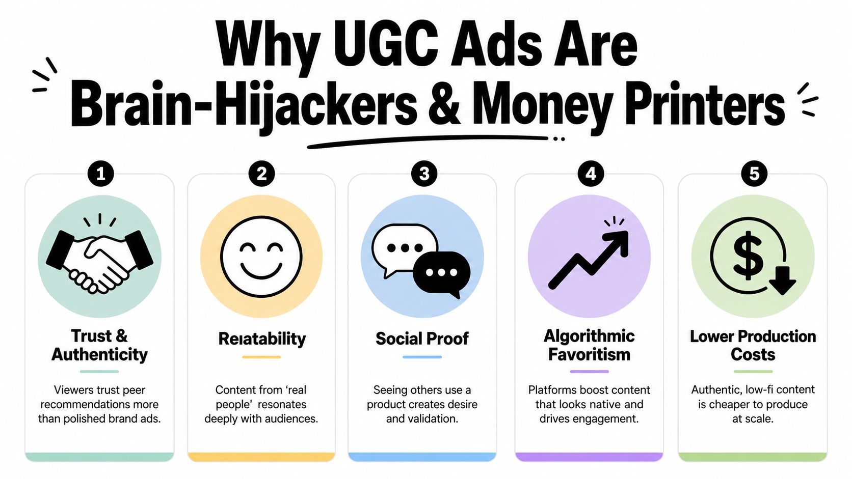
A key advantage is not "authenticity" as a buzzword. It is reduced resistance.
A founder selfie, a customer demo in a messy bathroom, a creator speaking like a normal person. These formats lower skepticism because they look closer to organic content than to a campaign asset that passed through six approval rounds. People still know they are being sold to. They just do not reject it instantly.
That is why performance marketers keep coming back to this format. Analysts cited in Amra & Elma's UGC statistics roundup found that UGC-style creative on Meta can beat polished brand ads on click-through rate while lowering click costs. If you have spent real money on acquisition, that result is not surprising. Ads that feel native get more chances to make their case.
Here is what drives the economics:
That last point gets ignored in fluffy guides.
UGC style ads do not print money because they are magically "more real." They print money because they let you produce, test, kill, and replace creative faster than polished production ever will. In a scaled account, speed beats beauty. The auction punishes stale creative hard, and the brands that can ship fresh concepts every week usually beat the brands protecting a precious hero video.
The production savings matter, but testing volume matters more.
A studio shoot can eat budget before you learn anything. UGC-style production lets you spread that same budget across more hooks, more angles, more creators, and more edit variations. That gives media buyers what they need: enough shots on goal to find a winner before fatigue sets in. If you want a broader look at how this works in practice, study these short-form video ad examples and frameworks.
This is also why finance teams stop complaining once they see the numbers. They do not care that the footage was shot on an iPhone. They care that one concept became eight testable ads, two held efficiency, and one scaled.
The expensive part of paid social is not production quality. It is creative decay.
UGC style ads improve the part of the funnel that usually breaks first. Attention at the top, trust in the middle, and enough credibility to earn the click.
That does not mean every polished asset is useless. It means polished assets rarely carry the account by themselves. UGC style creative does the hard labor. It keeps the testing engine alive, gives you more surface area for hooks and angles, and helps you stay native to the feed while everyone else is still trying to make commercials people never asked to watch.
Running the same asset on TikTok and Meta is lazy. It's also expensive. Every platform has its own visual language, and your ad has to speak it without an accent.
The first thing to understand is this. The first 3 seconds of a UGC ad determine 80% of the video's success, which makes the hook the most important variable in the whole asset, as noted by Koro's guide to UGC for Facebook ads. If the opening doesn't stop the scroll, the rest of your script might as well be an unpublished novel.
TikTok rewards movement, novelty, and a creator who sounds like they're saying something right now.
Use this simple formula:
Good TikTok hooks feel abrupt in a good way. “I bought this because…” works better than a polished setup. If it feels a little chaotic, you're probably close.
Meta is a different beast. A lot of users are scanning, not listening. That means your creative needs to work visually first.
For Facebook and Instagram, I like this structure:
| Platform | What to emphasize | What to avoid |
|---|---|---|
| TikTok | Fast hook, personality, native rhythm | Over-explaining in the first beat |
| Meta Feed and Reels | Bold text overlays, clear problem-solution arc, visible product payoff | Audio-dependent storytelling |
| YouTube Shorts | Demonstration, payoff, tutorial flavor | Weak opening frame |
| Aspirational visuals, transformation, simple use case | Loud, aggressive sales language |
If you need a clean starting point for building assets across placements, these short-form video ad examples and frameworks are a solid reference.
YouTube Shorts usually rewards a stronger explanation. The viewer is often willing to stay a little longer if there's a payoff. Demonstration beats vague testimonial here.
Pinterest is more visual and intent-heavy. People often arrive in planning mode. They want the after, the routine, the “how I got this result” angle. Less hype. More outcome.
Don't ask one video to do four jobs on four platforms. Cut native versions. The media bill is too high for laziness.
One product can carry multiple angles, but the delivery should shift:
Same product. Same core promise. Different creative language. That's how you stop wasting perfectly good concepts with bad placement behavior.
This is the chapter people skip because it's less fun than talking about “authentic storytelling.”
One winning ad is not a strategy. It's a pleasant surprise.
The key challenge is building a system that keeps producing new winners before the old ones fade. And they will fade. Meta data confirms that after just four exposures to the same UGC ad, the likelihood of conversion drops significantly, according to this LinkedIn post summarizing tests across hundreds of UGC-style ads. That's creative fatigue, and it does not care how much you loved your “hero” ad.
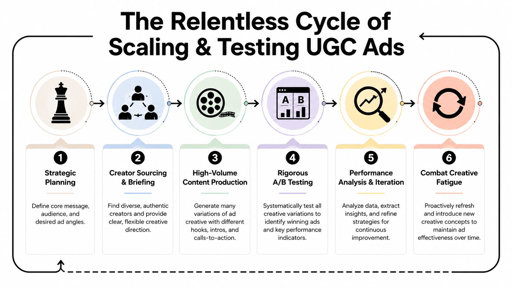
A real workflow is boring in the best way. It's repeatable. It doesn't rely on inspiration showing up on Tuesday.
My preferred operating rhythm looks like this:
That's how you squeeze signal out of creative. Not by throwing one “authentic” clip into the account and praying.
There's a useful but under-discussed wrinkle here. AI-generated UGC-style content can help you produce more variants faster, but it's not a free lunch. The workflow matters.
According to Pixis on AI UGC-style video ads, Meta's algorithm fatigues AI avatar content 35% faster than organic creator clips when not rotated every 7 days. The same source also notes that captions extend view time by 12%, that creative refresh every 7 to 14 days is required, and that sound-off Meta users visually scan text overlays 2.3x more than TikTok users.
That last point is where a lot of brands step on a rake. They produce one generic vertical asset, then reuse it everywhere. Meta users often need stronger on-screen text. Reels wants 9:16. Feed often benefits from 4:5. If you ignore those placement details, you're not scaling. You're smearing one mediocre asset across inventory.
For teams trying to clean up their reporting while testing creative at high volume, solid conversion tracking systems matter more than another brainstorm doc.
You need speed, but not chaos. My recommendation:
The best UGC teams don't “find winners.” They replace them on schedule.
That's the work. Not glamorous. Extremely profitable when done well.
Most UGC failures aren't mysterious. They're self-inflicted.
The first budget-killer is rights. Brands get excited, turn a creator clip into a paid asset, then realize usage terms weren't clear. Suddenly the “cheap creative” gets expensive fast. Handle rights up front, in writing, before anything goes live.
This one deserves emphasis. A brief is good. A script prison is not. Give creators the outcome, the angle, the must-say points, and the visual guardrails. Then let them speak like actual people who have met another human before.
Teams underestimate review workload. UGC style ads are faster to make, but they're also easier to make badly. That means more clips to review, more edits to request, more compliance checks, more comments to monitor, and more creative decisions happening every week.
So no, scaling UGC isn't about increasing spend and hoping for mercy. It's about increasing testing quality while protecting authenticity.
If your process rewards convenience over variation, fatigue will win. It always does.
By this point, the obvious question is who's supposed to manage all this without losing their mind.
Because this is a real job. Not a side quest for your generalist marketer between email flows and Shopify theme tweaks. Running UGC style ads properly takes creative judgment, platform fluency, testing discipline, and enough operational rigor to keep rights, edits, formats, and performance feedback from turning into soup.
You can do it yourself. That's noble. It's also how founders end up spending afternoons reviewing creator footage and arguing about text overlays instead of running the company.
You can hire a traditional agency. Sometimes that works. Sometimes you become account number twelve in somebody's Slack channel.
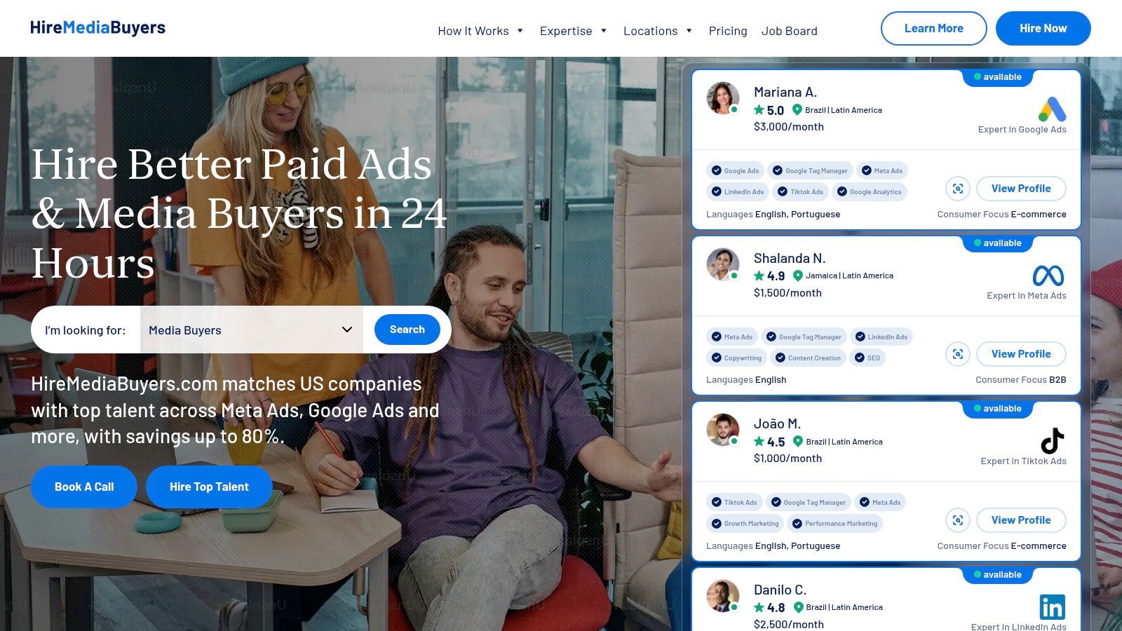
Or you can find a specialist who already knows how to run Meta and short-form creative like an operator, not a theorist. If you're looking for that kind of role, a vetted Facebook ads specialist marketplace is a much smarter place to start than rolling the dice on random applications.
Don't hire the person with the prettiest deck. Hire the person who can answer questions like these clearly:
| Ask this | Good sign |
|---|---|
| How do you brief creators? | They talk about angles, hooks, and platform nuances |
| How do you handle fatigue? | They already have a refresh cadence |
| How do you test creative? | They separate variables instead of changing everything at once |
| How do you adapt by platform? | They mention different cuts, ratios, and text behavior |
That's the filter.
The person who can run this playbook won't sound like a guru. They'll sound a little tired, very specific, and annoyingly practical. Which, in paid social, is usually exactly who you want.
If you want to stop guessing and hire someone who already understands how to brief, test, rotate, and scale UGC style ads, HireMediaBuyers.com is the sensible shortcut. You can find pre-vetted paid media talent without burning weeks on sourcing, screening, and hoping the resume matches reality.


